CASE STUDY: Open Campus
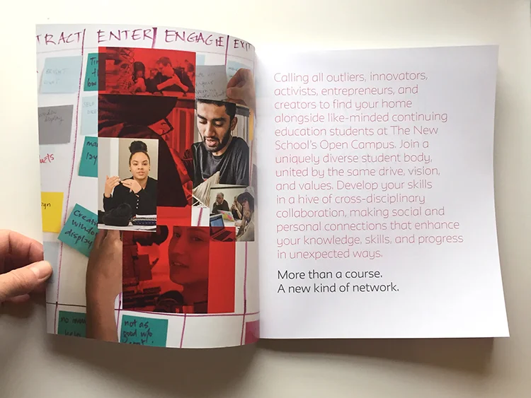
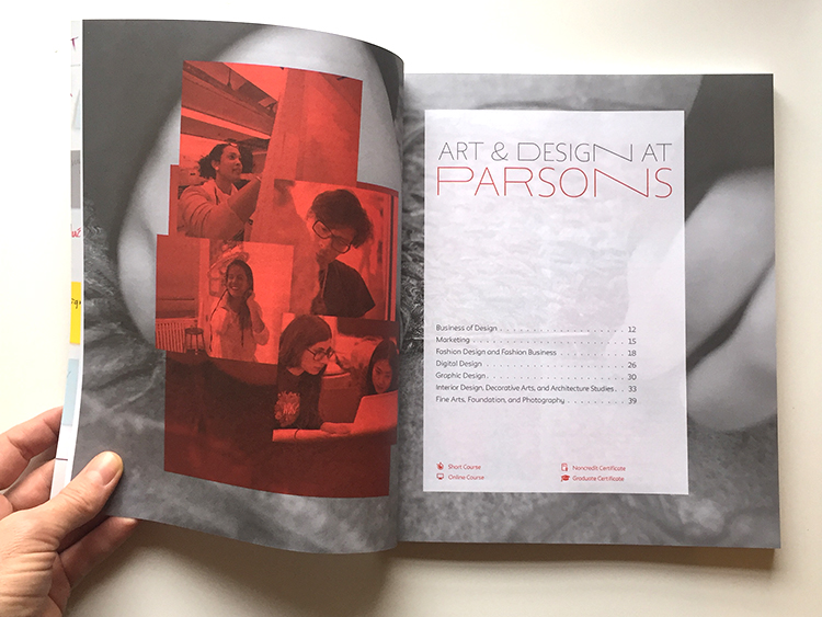
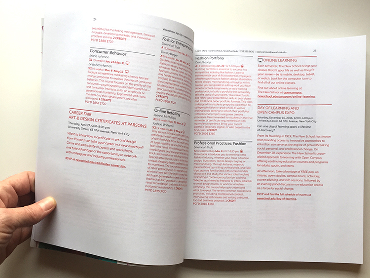
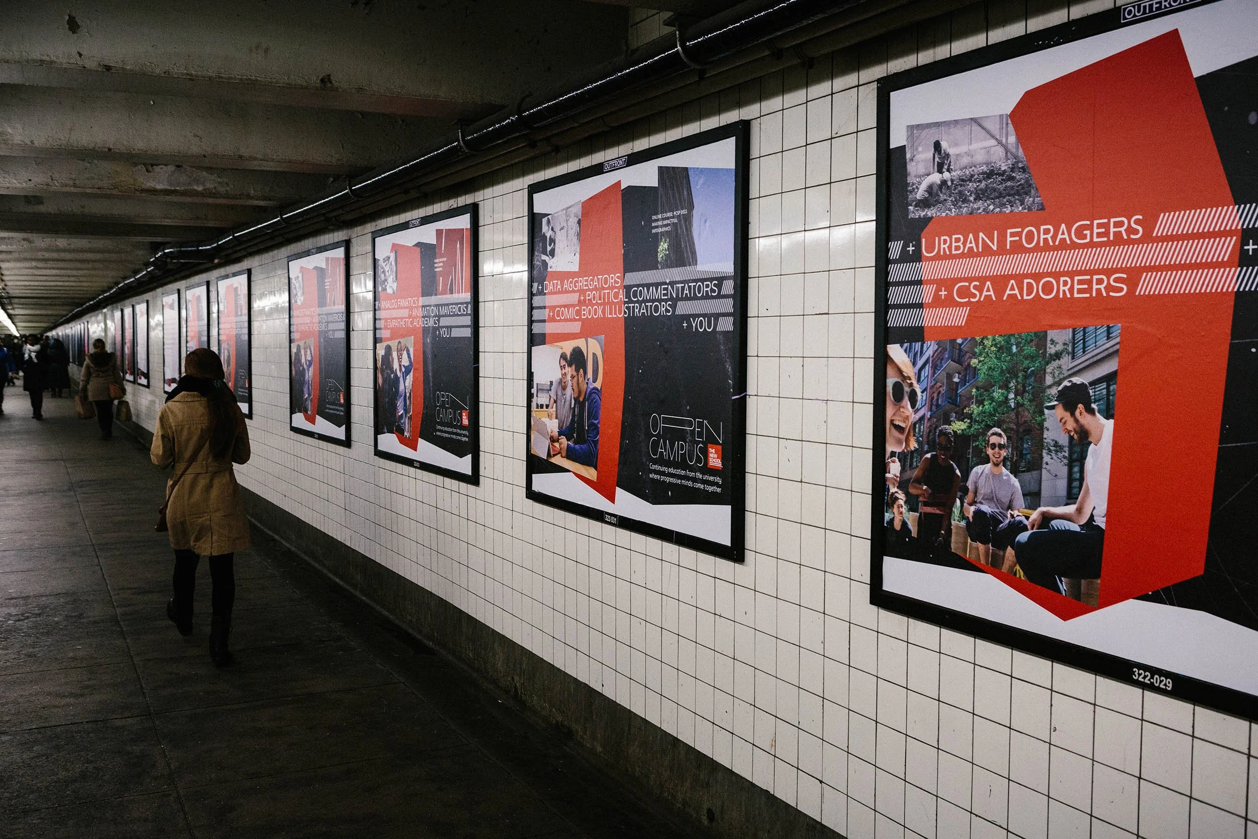
As lead designer at The New School, I spearheaded the complete rebrand and ongoing visual evolution of the university's continuing education division from 2017-2021. The project began with repositioning scattered continuing education offerings under a unified Open Campus brand, requiring a new identity that would relate to the established university brand while clearly differentiating non-degree programs. I developed a variable logo system built on a customized version of The New School's bespoke typeface, Neue, creating flexible brand architecture that could adapt across diverse program offerings. Following the initial launch, I provided ongoing creative direction as the brand expanded across multiple touchpoints—from redesigned catalogs featuring expressive photography and strategic use of Parsons red, to large-scale advertising campaigns including MTA transit placements. Over four years, I guided the brand's maturation from launch concept to refined professional identity, managing both strategic evolution and day-to-day application across an expanding portfolio.
-
Brand architecture development — Creating cohesive identity systems that maintain family relationships while establishing clear differentiation
Typographic customization — Adapting bespoke typeface systems to serve new brand requirements
Multi-year creative direction — Sustaining brand vision through growth phases and evolving market positioning
Cross-platform campaign development — Scaling brand language from print catalogs to large-format transit advertising
Team leadership — Managing junior designers and coordinating with external creative partners
Brand evolution strategy — Guiding systematic refinement from experimental launch identity to mature professional voice
Educational marketing expertise — Understanding the unique positioning challenges of continuing education in competitive markets
-
Art Direction: Ed Pusz, John Lepak
Lead Designer/Creative Direction: Carmen Mcleod
Animation: Ian Foster, Rebecca Sherman
Additional Design: Francis Pharr, Christine Wang, Gracia Echeverria
Editorial: Leslie Goldman, Alison Gragnano, John Haffner-Layden, Ricky Tucker



Early Version of the Open Campus website




Open Campus course catalogues